Monday 28 December 2015

Texture Definition

For the purposes of this article, texture photography is any imagery that depends, at least partly, for its impact on the texture of the objects in the image. Texture will be definedas the surface detail of an object.

I like the close up of this mat as it really shows an intricate detailed view of the mat, it shows all the different strands coming off it and really shows of the pattern.

In this picture you can see the different types of texture, you can see the smooth flat texture of the water and the smooth and bumpy texture of the tiles this shows a lot of variation in texture.


This image is really cool in showing the texture of all the different shoe imprints in the sand, the sand is a really great medium for showing the detail in texture.

This close up of the elephant from front on beautifully shows off the texture of its face and the changes that are throughout it, from the angle there is lots of detail to be seen, the dry, rough, lined texture face of the elephant is shown very well.


Colour Definition

              colour definition: Color photography is photography that uses media capable of reproducing colors. By contrast, black-and-white (monochrome) photography records only a single channel of luminance (brightness) and uses media capable only of showing shades of gray.


This image is great in showing the vibrance and
difference in colour, this picture has been photo
shopped and so the most have colourful part being
the sweets have been left with colour.


This image was taken with a long exposure, the bright colour of the light appearing as yellow captures the movement of light which portrays a shape.


This image is bright and full of lots of different colours, the lights up close are blurred and makes the colours look large and bold, this gives a really cool blurred effect.


I love this image because the colour that your automatically drawn to is the yellow from the tram and this is emphasized by the way that all the surroundings are white and grey this is a perfect shot showing off how colour draws in one.

My own definition: Colour photograpy is the way in which media technology portrays a colour ie monochrome or in full colour spectrum.


Friday 18 December 2015

Movement Image Bank

This image is very effective in showing the direction of movement that the wheel makes, the camera would have been put on a very large shutter speed to capture the light and make it look as though its all joined up in lines that show the route that the wheel makes.
I love this image as the 2 dice which are the shapes, the 2 main subjects are focused in and a trail of where they have moved from has been left behind them. There route of movement is effectively shown in the image as you can see the twists and turns that it makes to go to where the dice are now static.
This image is really effective in showing change of movement as, in this image the main subjects are actually the blurred movements of the two people walking away from each other this is unusual and makes them appear ghost like in their movements,
This shot is an action shot (still), the movement of this image is captured in the static presence of the image and not in a blurred lines unlike the 3 images before. The part of the picture that is viewed to be the moving part is the woman's hair, it is instantly the subject because it is illuminated by the sun glowing through her hair, this is effective in showing movement because it is still and needs to be imagined.


What i love about this image is that all of it is in focus, despite this, the tomato is automatically the subject or where the focus is drawn to as that is where the movement is occurring, the liquid coming out of the object is perfectly clear and easy to see the movement and direction that it's travelling in, this is an interesting way of portraying movement.
This is my favorite image because of the colors and the effect of movement that the blur creates, the blurred quality of this image makes the viewer think that all the movement is from the person taking the picture on the ground, this is a very interesting effect and i love the way movement is very clear because of the way the dark silhouettes of the trees falls on the bright backdrop.

Reflection Image Bank

The reflection in this image is emphasized by the dark outline of the bike against the bright colorful backdrop, the reflection in this image is very effective and beautiful as the reflection of the bike in the water is almost perfectly symmetrical this is unique and aesthetically pleasing.
The angle of this shot totally makes this image as without the perspective that the angle has in this shot the reflection would not be visible. The way in which a reflection is cast in this image means the light needs to be bright on it to make it visible and the surface has to be wet to reflect, this means it's a technically challenging shot.
This shot is very interesting and innovative, she has taken multiple pictures to give the impression of herself being reflected smaller and smaller inside a mirror that she is holding in the image, this is a cool picture that really shows of reflection.
This is a beautiful landscape shot of reflection, it is very clear and vibrant, the clouds and foliage cast a vivid reflection in the lake in the picture.
The reflection in this image is of a figure standing in shoes, the reflection appears on the wet, puddle surface of the tarmac, the only object that appears in the image that could cast a reflection are the shoes, this is a very cool effect as the image has been photo shopped so the reflection of the figure standing there is still visible and yet the man is not.
I love this image as the main subject is a small pot on a concrete surface and image shown in the puddle inside the pot is the reflection of the overhanging branches above the ground, this creates a really interesting effect, the fact that the image is in black and white really helps to emphasize the contrast in colour which helps to bring out the shape of the branches in the reflection.

Tone Image Bank

This image has lots of different tones that make up the composition of this shot, the tone changes quite dramatically, the bottom of the picture is all quite dark and then it slowly moves up and changes until the top is a very light tone.
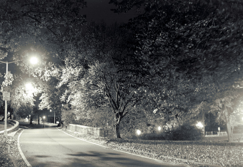
I like this image because the leading line is the road, which is also the main subject, the viewer follows the road from dark to light this shows the change in tone which is controlled by the darkness of this image, all the lights very the tone greatly in different places.
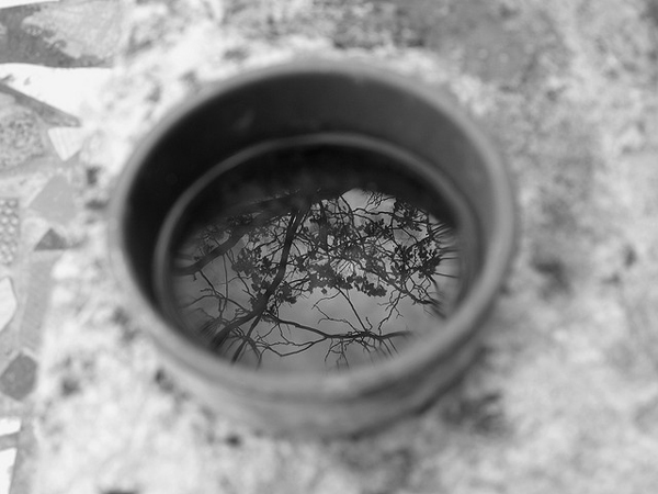
I love this image because the main subject being the ring, where a boat ties its rope to, sets the tone for the whole piece as the dark tone of the ring contrasts with the lighter and more brightly toned background and other parts of the picture.
The tone of this image is great because the dark tones of the main subject in this image is the black outline of the castle and trees, this reflects into the water which makes an almost as dark tone but a near identical reflection, the tone of the water and sky are more light in tone, this therefore creates a lot of variation in tone.
The main subject of this image is the outcrop of land on the beach, it is the thing that one's attention is automatically drawn to because of the dark tone, in contrast to the rest of the image all the tones are lighter apart from the reflection cast in the wet sand of the hill, this is a very interesting shot.
The angle of the Eiffel tower is amazing, because the image is in black and white, it makes mute differences in tone really stand out, the tones in the image starts off lighter and then as one's eyes follow the subject. the image gets darker and darker at the top.

Tuesday 15 December 2015

Portraiture Image Bank


The image is very airy and spacious, the entirety of the colours are light and cream coloured, the contrast of the darker colours on the ground work against the lighter colours of his suit and backdrop and then change into the more vibrant colours of the branches. All these elements come together to make a very interesting image to look at. Alec Soth also encompasses the whole of his body and what he is wearing gives an idea to the context of the image.

I like the colours chosen to be put in the backdrop, they are effective in showing off different features and parts of a subject in each section for example, in the top left the backdrop is most dull, Thomas Ruff could of done this because in the man there is little variation of colour and his facial expressions are the most blank and withdrawn. I like the emotionless expressions of all the subjects and the backdrop colour that has been used for each and the crop of each shot, this all comes together to give a almost surrealist impression.
This picture is very effective in showing contextual intention, David Lapachelle purposely took this shot to show off the message and meaning behind this image. I like how the image is from above his knees upwards and the backdrop is green and yellow as it contrasts with his body colour.

I like how this portrait is taken as it is unusual because it is of two people, the image is interesting as the shot shows only the the breast upwards of the woman at the front (Patti Smith) and from where the man at the back (Ropert Mappelthorpe) is sitting, this is an effective shot as it shows two different dynamics in the human body. Black and white really helps to bring out the mute changes in colour and tone within this image.
I love this image as it encompasses only Thom Yorke's face and a part of his wrist and arms, the black and white helps to bring out the subtle changes in tone etc, the main subject is the expression of his face and the dark colours help to fit in with the distressed facial expressions made in this shot. The shot could've been taken in this way to show the emotional commitment required from Thom in writing the songs for the band.
This portrait is excellent in showing of tone, the backdrop being white as well as most of his shirt helps to show off his body features as he is very pale and the other white elements help to show off the subtle changes in colour in this image. I love the angle of this shot as Archy looks down on the camera, his stance and amount of body in this image makes for a very empowering shot as his facial expressions and stare creates an emotional atmosphere.

Tuesday 8 December 2015

Portraiture (Low Lighting)

Low key lighting portraiture

Irving Penn, Snoot, Honeycomb, Reflectordish.

was an American photographer known for his fashion photographyportraits, and still lifes. Penn's career included work at Voguemagazine, and independent advertising work for clients including Issey Miyake and Clinique. His work has been exhibited internationally and continues to inform the art of photography.

Sunday 6 December 2015

Line work diary

When shooting line i went out with grace, we took pictures, in the local town, we wanted to incorporate as many different types of lines in the shoot as possible.
In the first picture the leading line is on the wall it is the blue line which runs horizontal across the image, this draws most of the attention as despite it being 2d and only different colors it still becomes the leading line. I like how there are lots of different lines within the picture including; vertical and diagonal, it makes the viewers eyes change to different angles.


In the 2nd image the leading lines are the the lines of the two walls either side of the image the run vertically off into the distance. parallel, the gap in the middle of the two leading lines gets smaller as the distance increases. The canopy of the building on top left corner has vertical and horizontal lines. This image is very effective in showing lots of different types of line.
Progression: When shooting in the future i would like to use lines as a backdrop and people as the subject and view the way these two elements contrast and work together.
In the future i would like to adjust shutter speed to emphasise the angles and directions of line, this picture is very effective in showing the changes that line makes.

Tuesday 1 December 2015

Portraiture (Editing Posts)


 Here is the original image, for the 2nd image i changed the hue and saturation and colour balance to ultimately change the colour, i decided to change her face to black and white this helps to keep the tone in. I change the colours to blue, this made the colours change to a purple, red indigo blend. I like the effect that this has on the picture, it contrasts the colours.


In the picture of Morgan i used burn and dodge, i used the tool to emphasize the changes in tone across her face for example, the tone under her chin when it becomes darker because of the shadow cast from her jaw line. I also emphasized a clear tone across most of her face and then i used the burn tool her eyes to show change of tone once again,, i like the effect that this has given to her face as though it is not subtle and unrealistic, i like the surreal and animated effect it has as it really brings out change of tone and the angle of this portrait also really helps to show this.