Connecting Essay 1
In this image that I found online, you can clearly see it is a street photography reflection shot, the angle and clarity of this shot is fantastic, as the image is almost symmetrical giving a really interesting effect. The image seems to capture the day to day busy lives of people in the city, the main subject is a man in the suit and he looks like a product of the american dream; buissness man striving to do well. The image denotes money, commerce and capitalism.

In this image that Grace Cambridge took of me, I am facing my reflection in a glass panel of a building, like the shot above it is also a street photography image, however this image can connote different meanings such as self-questioning, reality, youth, body image and confusion. The tones in this image aren't as interesting mainly because the angle of the shot is face on to the reflecting object which definitely detracts from the technique used to show the reflection of different life in a street. The black and white of the image above definitely helps to show change of tone from the image and the reflection itself as well as adding effect.
Connecting Essay 2
In this image tone varies greatly, as most light tones start from the window where the light originates from, this is a very clever image as the light that beams on to the boy then casts a shadow, the image is very effective in creating mood and atmosphere, it creates a melancholy, reflective feel. The darkest tone is the boy as he blocks all the light out as he appears almost as a silhouette.
In this image that I took of tone, I wanted to capture it by a window because of the light i though it would create more tone, this has been achieved. The image has a melancholy, lonely atmosphere. What i like about the image above in comparison to my image is the range of tone and this is really controlled by the the angle and frame of shot as this picture doesn't allow any shadow to be cast, whereas the shot above is at the appropriate angle for a shadow to be made creating more diversity in tone.
Connecting Essay 3
In this image, the photographer has clearly tried to shoot shape. The angle of the shot completely make the image as if it was taken from another angle it would look completely different, all of these great jagged formations are created because of the way the image has been taken. The image connotes money and the decadent society, all the shapes are very in form which can represent life in the city. The colours in the image are great, and vibrant, the blue backdrop makes the colours of the buildings all really stand out.

In this image i took of where the parts of a building meet and connect, you can clearly see some prominent formations and shapes in the stature of the building. I purposefully took the picture from this angle as i saw the way that the components joined and thought it would be a great opportunity for me to get a closeup shot of the shapes from a steep upwards angle. All the shapes come together to build a futuristic shape, and the fact that the construct is almost symmetrical means that shape is well presented.
Connecting Essay 4
This joiner photography piece, is a great example of joining. There is good depth of field and perspective as you can see for a long distance as there is a lot of depth. The landscape is cleverly constructed to make the image come to life more and look more physical. All the different individuals shots that make up the image give a really great perspective, deep angled shot. The subject at the front of the image really captures the image as this also helps to add perspective to the shot.

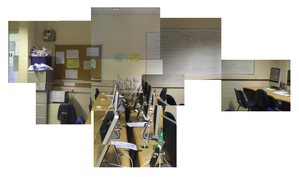
This image is of a joiner i constructed, this is a very patchy image as there not enough individual shots. I took a wide angled range of shots to add perspective for example the computers at the centre of the image come down to near where i took the actual image and yet the computer on the far right hand corner ranges very far from where i took the shot. I think i did a good job of capturing depth of field, however if i had a person in my shot as my main subject i would've been able to capture depth and perspective better such as in the picture above.
Connecting Essay 5
In this portraiture image, the shot looks very natural as their is little to no artificial lighting, her skin tone looks natural and similar throughout. The light red colour for the backdrop contrasts really well with the browns and dark blue colour that she exhibits. The image is very formal and in the style of a pass-port photo. The image connotes blankness and disengagement.
In the image that I took, I tried to pick a suitable coloured backdrop for my subject, I thought the orange contrasted well with her hair colour and what she was wearing. The frame shot is not as good as the photo above's as in this image there is more un-needed space that is the same, it also means that this image lacks facial detail as it is not as close up. This image is warm and natural.


